Way, Way, Waaaay Nicer Error Messages!
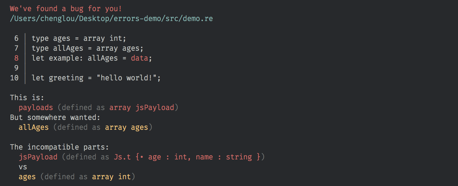
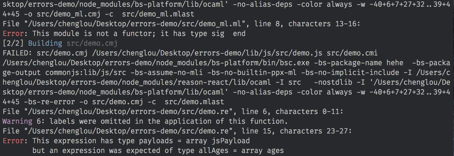
A picture's worth a thousand words.
Before:

After:

Sometimes when I'm busy working, some random colleague/Discord member would ping me and tell me "Yo Cheng Lou why are Reason's errors so bad? Why can't you be more like Elm Cheng Lou? Why? Look at how great Elm's errors are Cheng Lou, look."
In reality I'm pretty darn ashamed of our error messages; here we are, a type system with two decades of solid research and implementation, but sometimes presented to the end users as if it's something that'd get in their way.
No more! We've heard you loud and clear, and delivered you much improved error messages! A few things we did:
- Display the error-ing line(s), right inside the terminal.
- Better colors, for quicker visual search.
- Improved messages in many cases.
- Errors in Reason syntax for Reason files.
- A bit of breathing room between lines.
The last point is a tradeoff; errors end up taking more space. Seeing that you'd usually focus on a single error rather than trying to get an overview of all errors, we've deemed this tradeoff worthwhile, especially in the context of a big amount of build output. Considering the new warning format:

Here's the same warning, old version, buried among other outputs:

At Messenger, we've seen people ship warnings to production not because they didn't want to fix them, but because they've missed them! It's not rocket science. Leave some negative space here and there. Color things appropriately. Voilà!
The new errors can be turned on by adding "bsc-flags": ["-bs-super-errors"] to your bsconfig.json, like so. They're also available for bsb-native. True to our stack's spirit, they're fast, simple to configure, and solid.
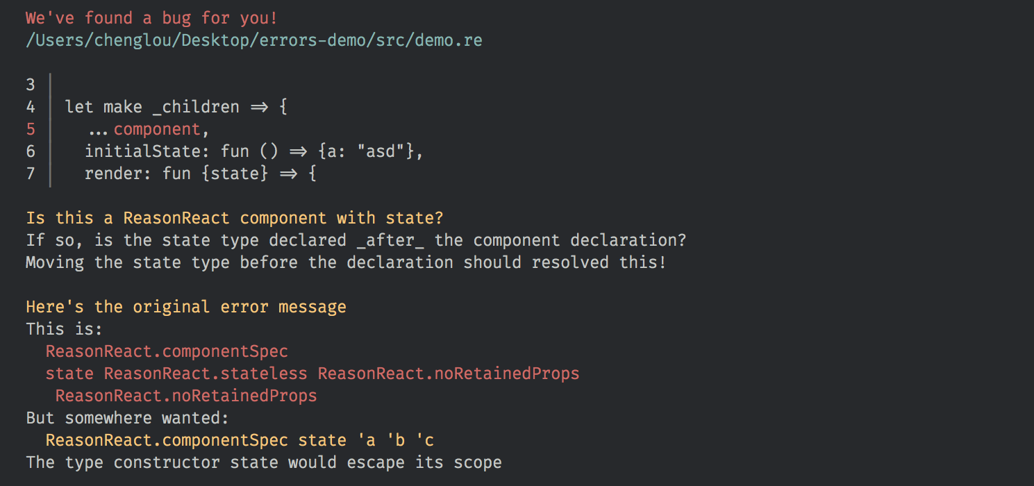
One more thing: we're vertically integrated common pitfalls of ReasonReact into these messages too, when applicable.

This is just the first of many iterations to come! Got a message you'd like to see explained better? File an issue here!
Enjoy =)
